
The logo consists of a main logo, a sign and a text and can also occur without a text.
SAMK logo
The SAMK logo describes an information arrow and the way forward. The sphere symbolizes the eternity that occurs in nature and the universe on many levels, cf. sun. Our clear and “simple” logo reflects timelessness and clarity.
The logo is always horizontal. The logo must not be used in full blue. The logo must stand out clearly from the background. There must be enough blank space around the logo (protection area).
The logo consists of the main logo, brand and sub-logo and can also appear without the sub-logo. When the logo is in a very small size, the sub-logo is not used.
Download (on samk.kuvat.fi) the SAMK logo and get acquainted with the logo instructions.
The blue logo reflects credibility, reliability and creativity. The logo reform made in 2008 and the uniform logo colour were intended to create a new uniform SAMK. Additional colours can be used to highlight, in addition to the logo colour.
Brand and additional colours
Brand colour
 CMYK: cyan 100, magenta 0, yellow 10, black 0
RGB: red 0, green 165, blue 205 | Web colour: #00a5cd
Additional colours
 RGB: red 85, green 207, blue 237 | Web colour: #55CFED
Note! Use the additional blue colour only on web pages
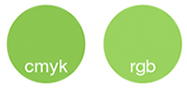 CMYK: cyan 50, magenta 0, yellow 90, black 0
RGB: red 154, green 211, blue 94 | Web colour: #9AD35E
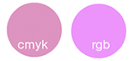
CMYK; cyan 10, magenta 50, yellow 0, black 0
RGB: red 236, green 148, blue 251 | Web colour: #EC94FB
 CMYK: cyan 0, magenta 55, yellow 90, black 0
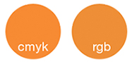
RGB: red 238, green 143, blue 55 | Web colour: #EE8F37
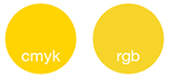 CMYK: cyan 0, magenta 15, yellow 100, black 0
RGB: red 247, green 213, blue 40 | Web colour: #F7D528
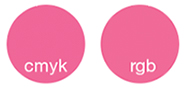 CMYK: cyan 0, magenta 75, yellow 10, black 0
RGB: red 240, green 106, blue 152 | Web colour: #F06A98
Typography
The font families used in SAMK's printed products are Helvetica Neue LT Std (main font, without inflections) and Garamond Premier Pro (with inflections).
In office use (PowerPoint presentations and the like) as well as on the internet, the Arial font (main font, without inflection) and Times font (with inflection) are used instead of the above-mentioned text types.
Slogan
Our slogan Think Future. is based on SAMK's strategy and arose from suggestions from our staff and students. The slogan sums up SAMK's role as a strong developer in the region: Satakunta University of Applied Sciences produces new know-how in the region. The slogan also fits well with SAMK's vision (each of our students will be employed).
SAMK's slogan can be used in visual form in SAMK's materials and cover images on social media.
The slogan also has its own tags: #ThinkFuture and #KatseTulevaisuuteen (in Finnish)
![]()

Text type: Helvetica Neue LT Std Heavy
Photography and SAMK
What is essential to SAMK's image world as for photographs, is showing our campus life and the environment. People play a major role, being natural and authentic is important. With the images, we want to highlight our everyday activities. We also like to highlight leisure time as well as the nature and beat in the surroundings.
We show true little moments that convey a happy atmosphere and great emotions - joy and happiness. In the images, the keywords are freedom, energy and community.
Images published by SAMK employees on social media are an important part of SAMK's image world.
In international marketing, in addition to images of learning situations and the campus environment, we also want to showcase the different seasons of nature in Satakunta. Images portraying family life, hobbies, and Finnish culture are also included. Through these visuals, we aim to convey that Satakunta is a safe and welcoming place to study.
You can find images of SAMK theme on samk.kuvat.fi (on samk.kuvat.fi). When publishing pictures, SAMK and the photographer must be mentioned (with the exception of adds).
